Design a small reaction set that still reads at chat size
Plan four useful reactions, keep a shared visual style, and test expressions, captions and export files without creating a pile of near-identical images.
One funny face can work on its own. A useful reaction set has a harder job: its images need to look related while communicating different meanings. Four nearly identical smiling faces may be attractive, but they do not offer four clear choices in a conversation.
Start with situations rather than a target number of images. For a small project chat, try “received,” “working on it,” “need a moment,” and “done.” These are examples, not universal meanings. If the same image would fit every message equally well, the expressions probably need more separation.
Define the shared parts first
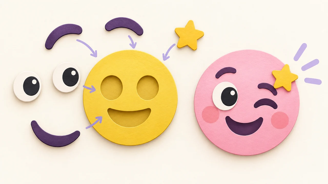
Choose a face shape, a limited palette and a general scale. Keep these stable while changing the expression. For example, all four reactions could use the same yellow face, dark brows and one pale accent. A consistent outline and similar margins make the images feel like a family even when the mouths differ.
Consistency does not mean freezing every position. A tired reaction may need lower eyes and a flatter mouth, while a “done” reaction may benefit from lifted brows. Keep the overall visual language stable and let the parts that carry meaning change. If every image uses a different face, background, font and accessory, comparison becomes harder.
Build one clean starting composition in the editor. Save an editable version before making variants. Changing a template or loading another design can replace the current arrangement, so do not rely on a single temporary tab draft to preserve all versions. Give saved designs descriptive names rather than four variations of “final.”
Separate meanings with shape, not only color
Imagine the reactions without their background colors. Can you still distinguish them? A green “done” and a red “wait” with identical faces place too much of the meaning on color. Different mouth shapes, eye directions or a simple gesture provide additional cues.
For “received,” try a restrained expression that does not imply celebration. For “working on it,” direct the gaze toward a small supporting object or use a focused brow. For “need a moment,” reduce the mouth and relax the eyes. For “done,” open the expression and leave it uncluttered. These are starting points: check whether your intended audience reads them the same way.
Make one change at a time. Move the mouth before changing the mouth asset, then adjust the brows. If the result becomes too angry or too cheerful, undo the last change instead of rebuilding the whole image. When parts overlap, selecting the intended row in the layer list is more reliable than repeatedly clicking the same crowded area.
Keep captions useful and short
A caption can disambiguate an expression, but it should not have to explain the entire design. Try one or two words. Reserve a consistent caption area and avoid covering the eyes. One font family and a repeatable size are easier to maintain across a set than several unrelated lettering styles.
Do not assume one caption works in every language. Translated phrases can be longer, and the selected font may fall back for unsupported characters. Check the actual words in each version, including accents and punctuation. Shortening the phrase is often better than shrinking it until it is unreadable.
Where the destination supports a text description or accompanying message, include the intended meaning. That also helps when a recipient cannot see the image clearly. Avoid using an image as the only way to communicate an important deadline, approval or warning.
Inspect at the size people will actually see
A large editor preview can hide small-scale problems. Export a sample, place it in the intended destination, and look at it at normal viewing size. Thin eyebrows may disappear, a detailed hat may become noise, or the gap between a mouth and the edge may become too small.
Compare the four reactions together on both light and dark backgrounds. Look for one face that feels much larger than the others and one caption that draws disproportionate attention. Adjust the composition rather than forcing every source image to identical dimensions: two shapes with the same width can have very different visual weight.
Use transparency if the reactions should blend into varied backgrounds. Use a solid background if the square itself is part of the design. Neither is automatically better. A patterned background that looks attractive at full size can compete with the face in a small preview, so remove it if it makes the expression harder to recognize.
Keep a working copy and a delivery copy
Editable designs and PNG exports serve different purposes. The working copy preserves independent layers for later changes. The PNG is the flattened file you share. Re-uploading a PNG does not restore separate brows, words and accessories.
Before sending the set, check the current export and membership rules, including watermarks and available sizes. Keep the file names meaningful, such as received, working, wait and done, so you can find the right result later. Send a test image to your chosen destination before distributing the whole set; applications can process files differently.
The final check is conversational: put each reaction next to a plausible message. Does “received” look like a promise that the work is already finished? Does “need a moment” look hostile? If so, change the expression or caption. The goal is not merely four coordinated pictures, but four useful answers.
Create the first reaction · Adjust layers and lettering · Start with a clear feeling